A premium law firm website concept built to communicate authority, simplify practice-area discovery, and increase consultation inquiries.
Silverstone Law
This demo shows how a small or mid-sized law firm can move from a dated brochure site to a more confident, better-structured digital presence. The direction prioritizes authority, clarity, and fast access to practice-area information.
What the redesign solves
- Generic messaging: The copy is reframed around legal outcomes, client concerns, and reasons to contact the firm.
- Practice areas buried in navigation: The site structure is simplified so visitors can find the right legal service faster.
- Low perceived credibility: Attorney bios, results framing, testimonials, and process clarity are moved into more prominent positions.
- Weak contact flow: Consultation actions are clearer and repeated naturally across the site.
Key page elements
- Homepage with authority cues: Stronger headline, refined typography, and clearer positioning for the firm.
- Practice-area landing pages: Better scanning for family law, personal injury, estate planning, business law, or criminal defense.
- Attorney profile pages: Credentials, experience, and trust factors are easier to evaluate.
- Consultation prompts: Calls to action are stronger without feeling aggressive.
Why it works for this niche
- Legal visitors often arrive stressed and uncertain. They need immediate clarity about whether the firm handles their issue.
- Stronger structure improves trust and reduces confusion.
- A premium but restrained design helps the firm look serious and established.
Best fit
- Boutique law firms
- Multi-attorney local firms
- Firms expanding practice-area visibility
- Practices that rely on consultation leads
Project outcome
The result is a legal website demo that feels more credible, more organized, and more aligned with how real prospects evaluate lawyers online.
A real estate website concept built to make listings easier to browse, agents more credible, and inquiries more likely.

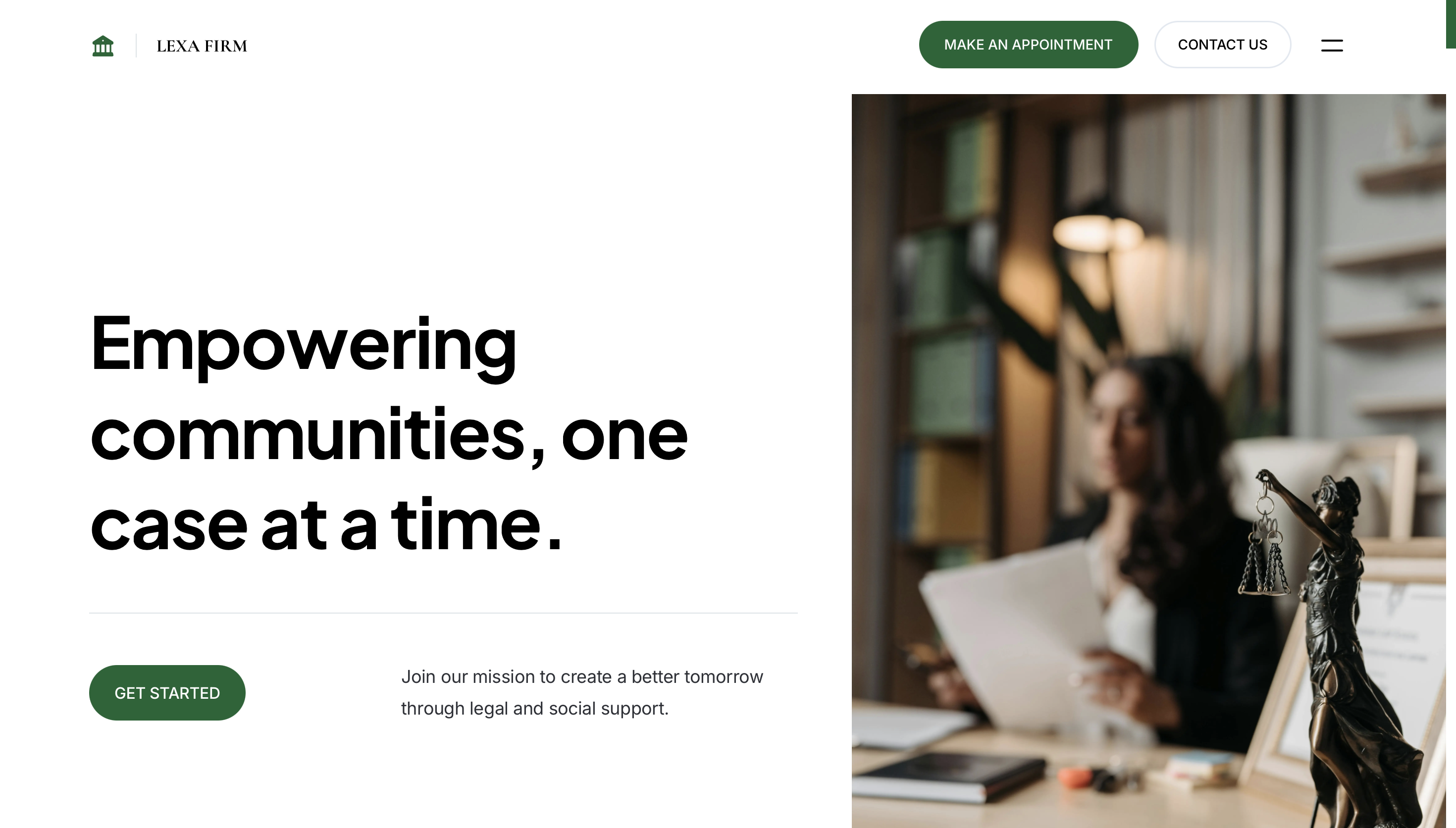
A premium law firm website concept built to communicate authority, simplify practice-area discovery, and increase consultation inquiries.
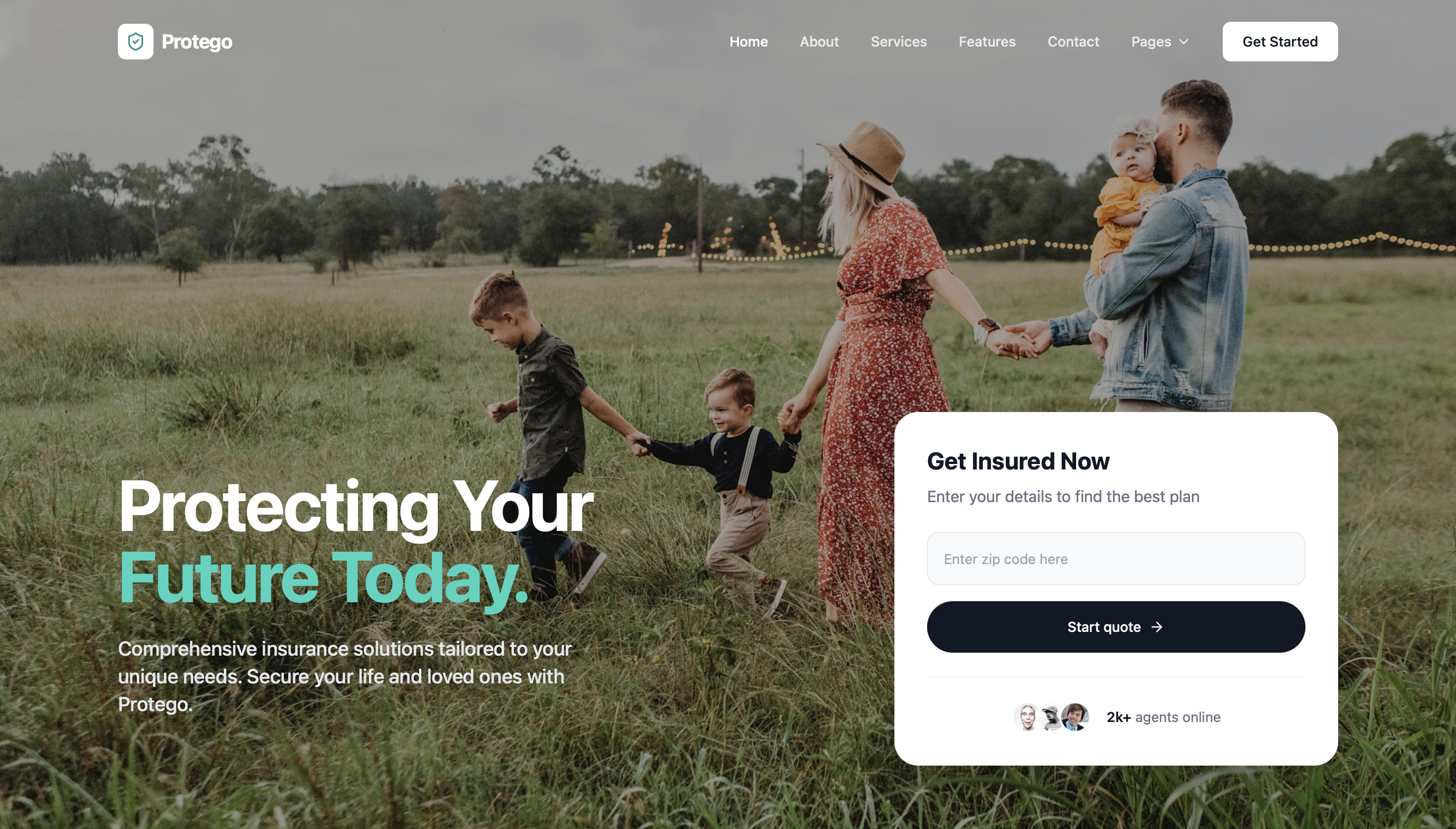
A cleaner insurance agency website concept that makes coverage options easier to understand and quote requests easier to submit.
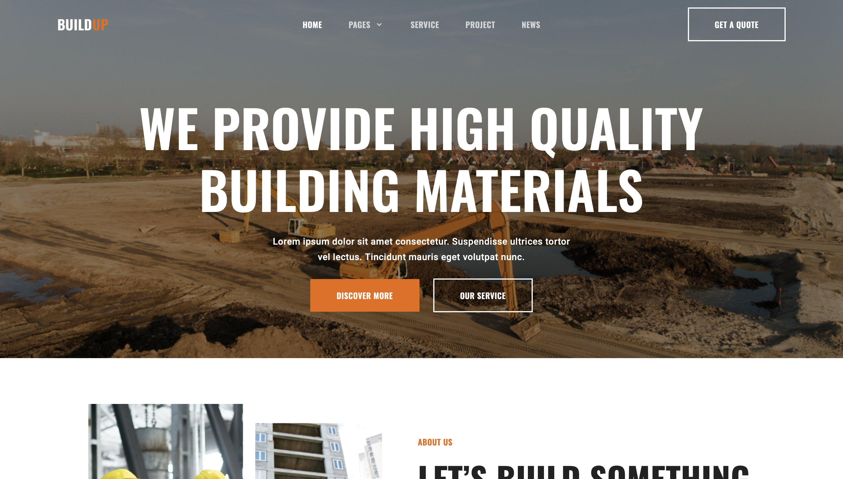
A contractor website concept designed to explain services clearly, showcase proof of work, and turn visits into quote requests.