A modern dental website concept focused on trust, cleaner service presentation, and more appointment inquiries.
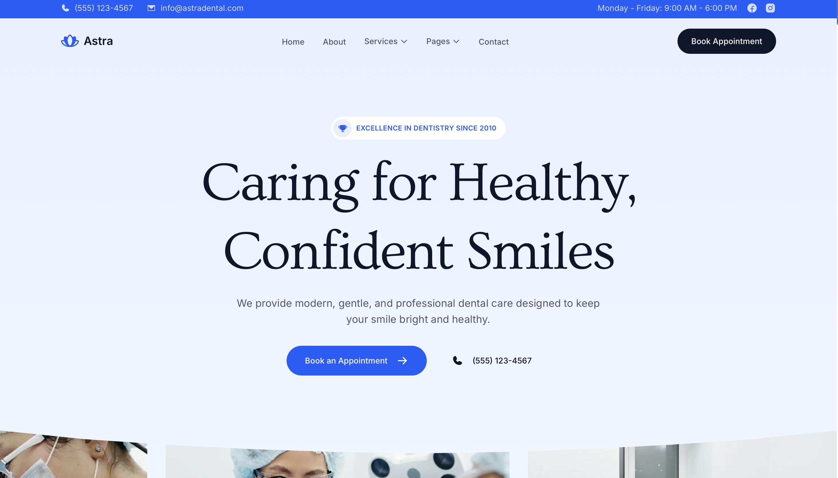
Bright Smiles Dental
This demo repositions an outdated dental office website into a cleaner, more reassuring experience for new patients. The emphasis is on professionalism, clear treatment information, doctor credibility, and an easier path to booking.
What the redesign solves
- Outdated first impression: The visual system is updated to feel established, modern, and hygienic without becoming cold.
- Confusing treatment pages: Services are grouped into simpler categories so patients can understand what is offered quickly.
- Weak trust signals: The homepage brings doctor profiles, office photography, reviews, and insurance/payment information forward.
- Poor mobile usability: Core actions like call, directions, and appointment requests stay clear on smaller screens.
Key page elements
- Homepage with strong trust framing: Immediate emphasis on experience, patient comfort, and common treatment categories.
- Doctor and team section: Helps the practice feel personal and credible instead of anonymous.
- Treatment landing pages: Clear explanations for implants, cosmetic work, cleanings, and emergency visits.
- Appointment flow: Fewer steps between a visitor landing on the site and requesting a visit.
Why it works for this niche
- Dental practices win business on trust before anything else. A patient often decides in seconds whether the office feels credible.
- Clear insurance, financing, reviews, and location information reduce hesitation.
- A better mobile experience matters because many visitors are searching while comparing providers locally.
Best fit
- General dentists
- Cosmetic dentistry offices
- Pediatric dental practices
- Multi-location clinics that need cleaner service structure
Project outcome
The result is a business website demo built to make the practice look more professional, increase patient confidence, and create a smoother path to appointment requests.
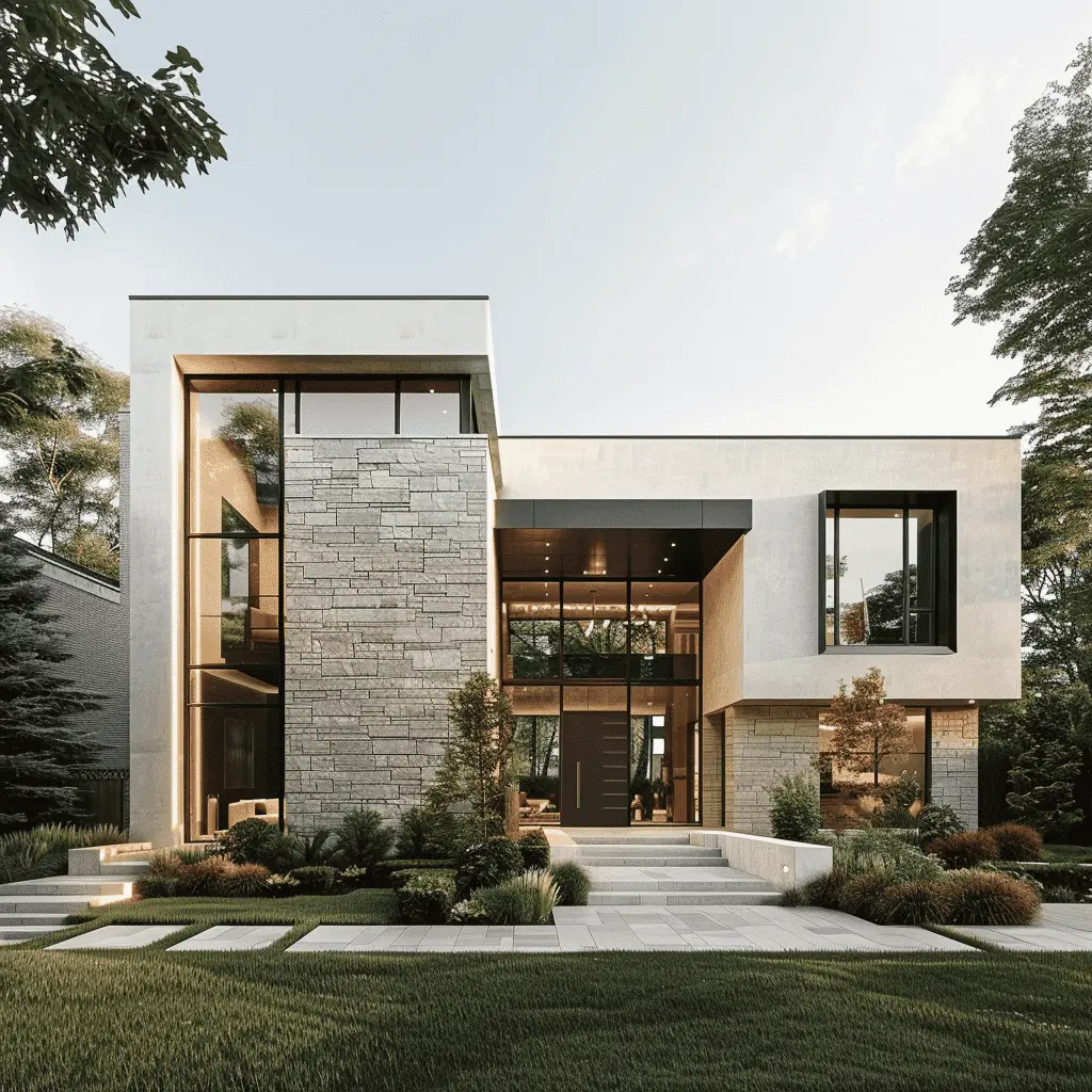
A real estate website concept built to make listings easier to browse, agents more credible, and inquiries more likely.
A premium law firm website concept built to communicate authority, simplify practice-area discovery, and increase consultation inquiries.
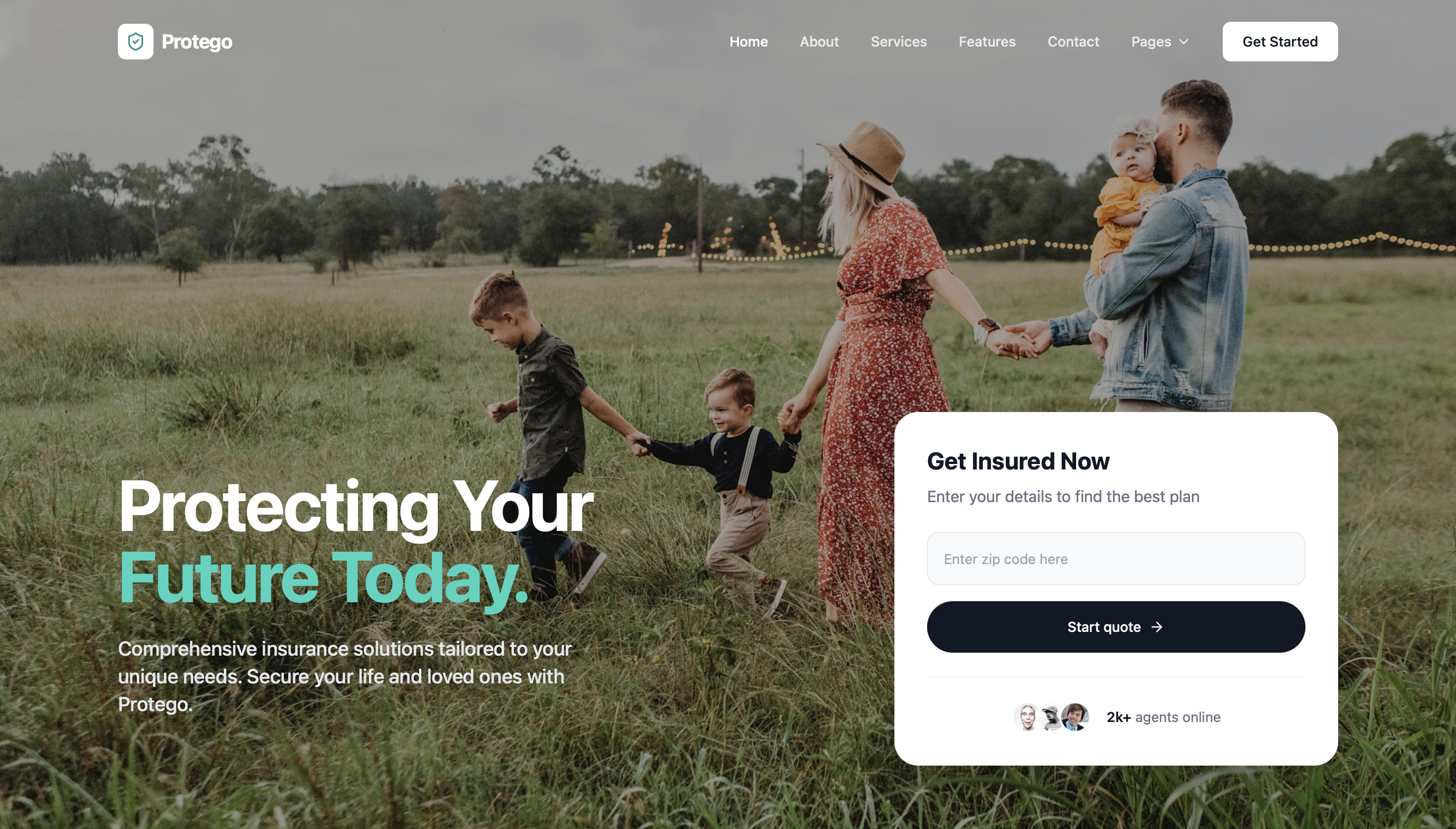
A cleaner insurance agency website concept that makes coverage options easier to understand and quote requests easier to submit.
A contractor website concept designed to explain services clearly, showcase proof of work, and turn visits into quote requests.