A restaurant website concept with stronger menu visibility, better mobile browsing, and cleaner reservation prompts.
RestoQ
This demo is built for restaurants that need a site with more atmosphere, better structure, and fewer missed opportunities from mobile visitors. The design is premium, but the purpose stays practical: help people view the menu, understand the experience, and reserve or call quickly.
What the redesign solves
- Slow menu access: Visitors can get to menus, hours, reservations, and location details immediately.
- Weak brand atmosphere: Photography, spacing, and typography are used to make the restaurant feel more memorable.
- Poor mobile layout: The experience is structured for the way real diners browse on phones.
- Buried business details: Parking, reservation rules, contact info, and map access are easier to find.
Key page elements
- Menu-first structure: Core food and drink information is easier to browse.
- Reservation and call prompts: Actions are repeated clearly without overwhelming the layout.
- Location and hours visibility: Essential details show up faster.
- Brand storytelling: The site communicates the restaurant's tone without sacrificing usability.
Why it works for this niche
- Diners decide quickly based on visual quality, convenience, and confidence that they have the right details.
- Better mobile design reduces friction between discovery and reservation.
- A more refined presentation supports both neighborhood loyalty and new customer conversion.
Best fit
- Restaurants with outdated sites
- New concepts needing a polished launch presence
- Cafes and upscale casual spots
- Hospitality brands that depend on mobile traffic
Project outcome
The result is a restaurant website demo that looks more premium, communicates the brand more clearly, and makes reservations and contact actions easier to complete.
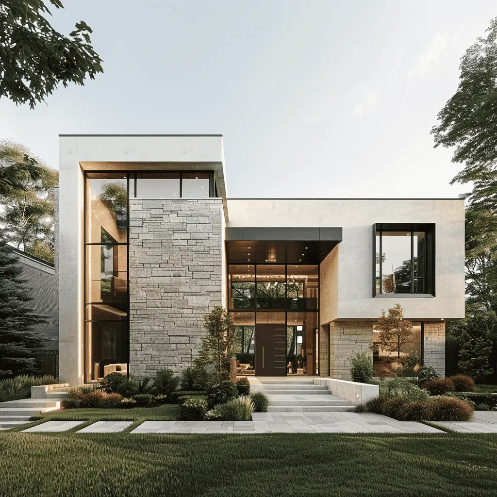
A real estate website concept built to make listings easier to browse, agents more credible, and inquiries more likely.
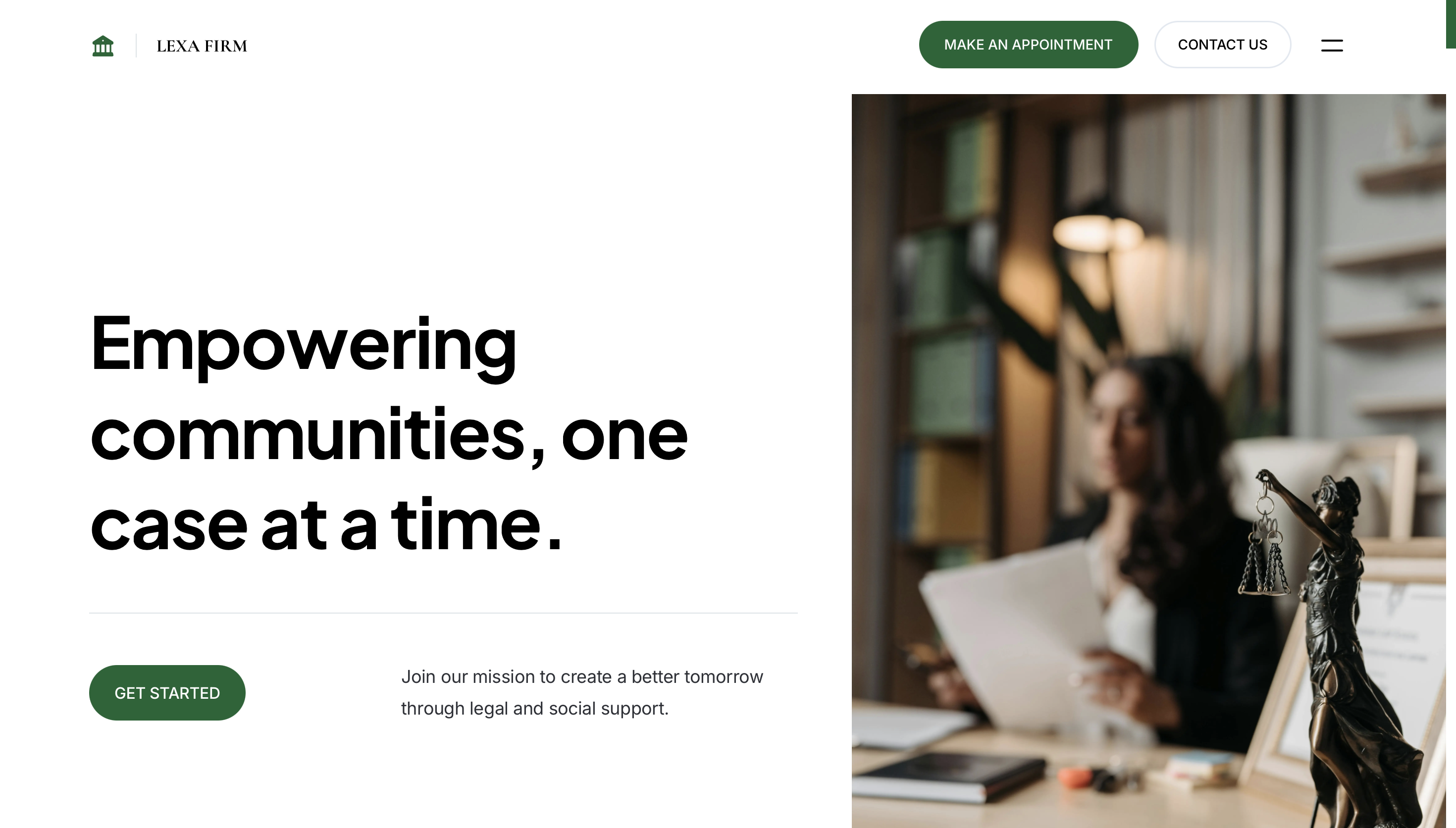
A premium law firm website concept built to communicate authority, simplify practice-area discovery, and increase consultation inquiries.
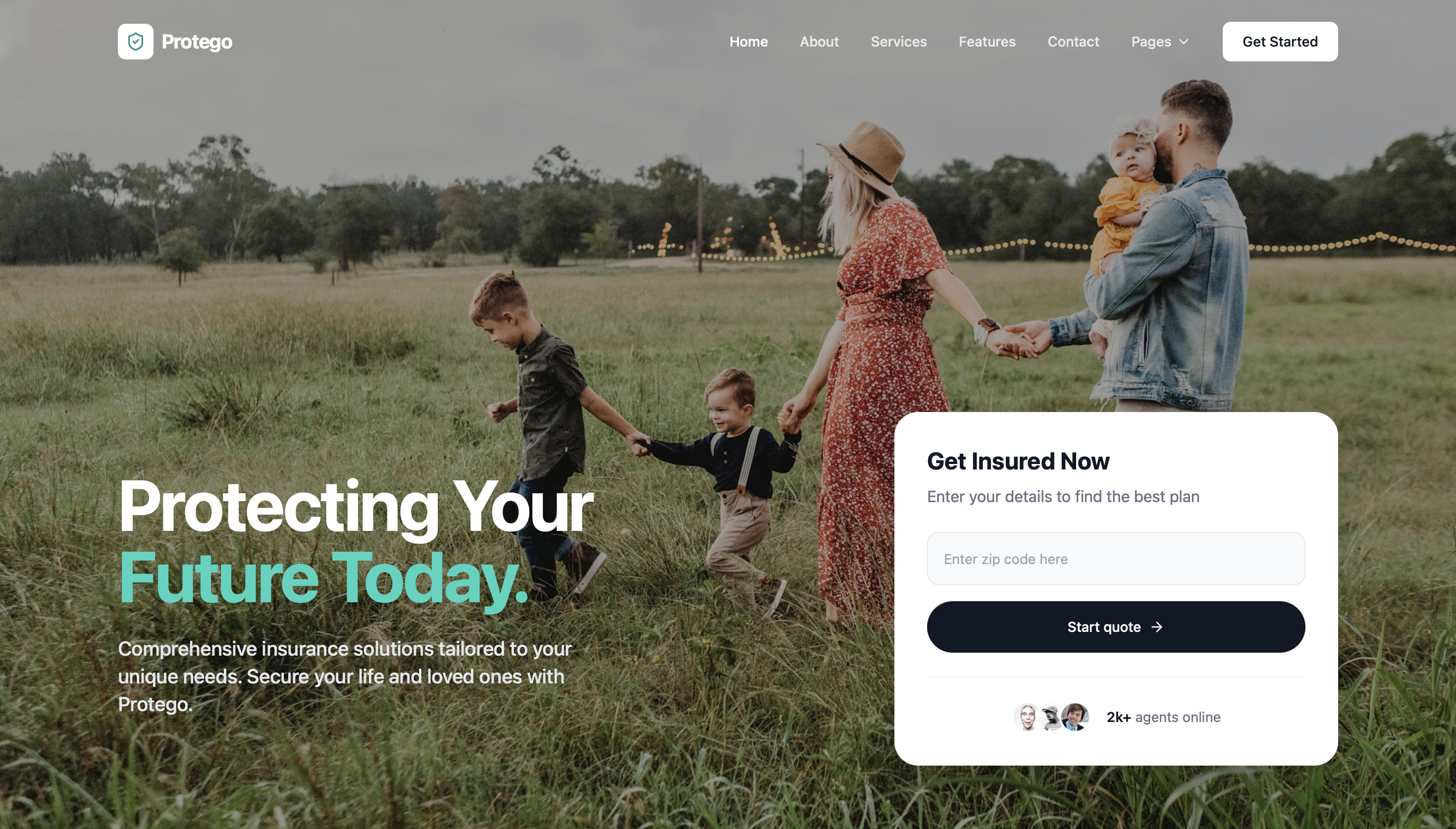
A cleaner insurance agency website concept that makes coverage options easier to understand and quote requests easier to submit.
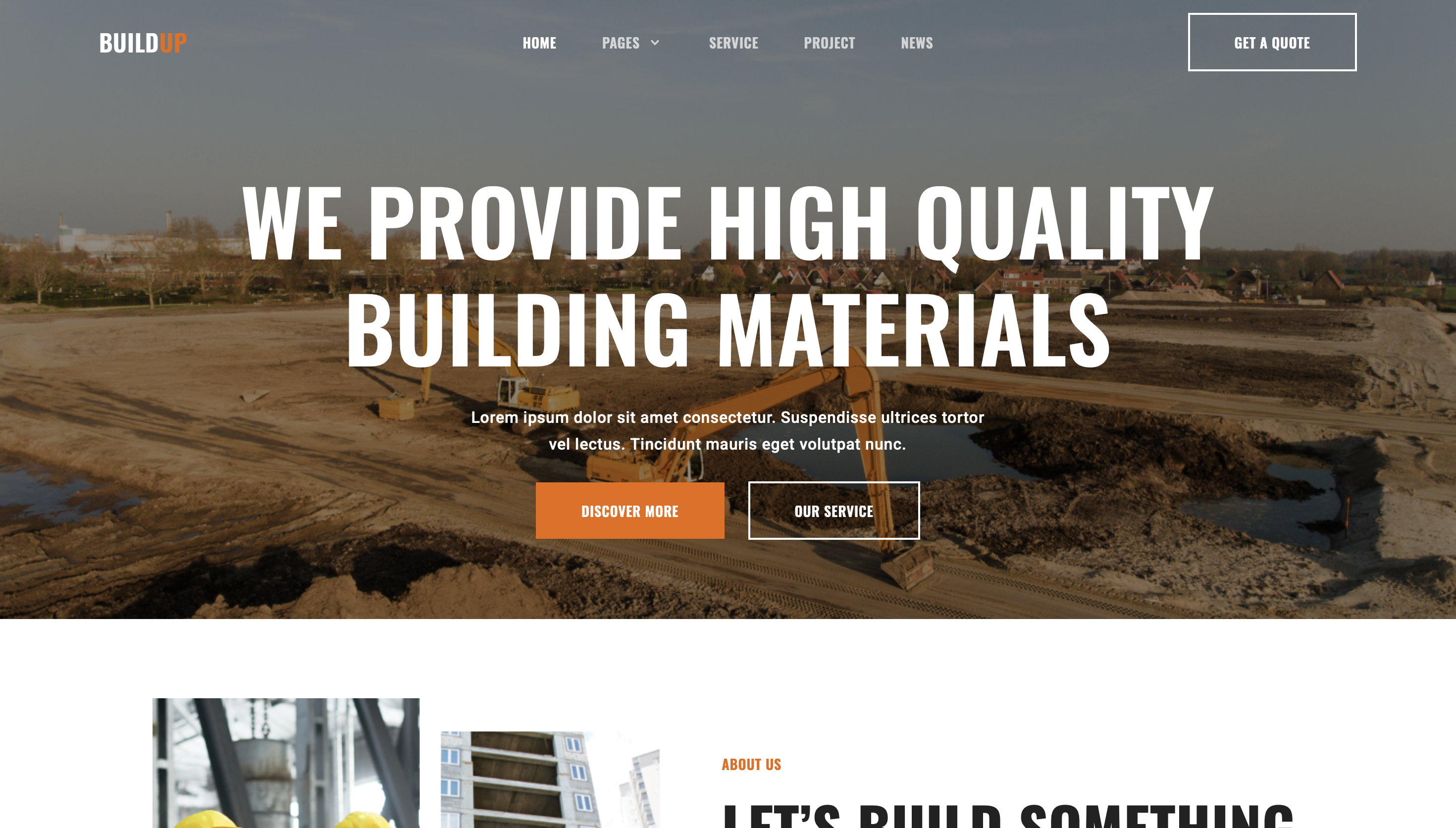
A contractor website concept designed to explain services clearly, showcase proof of work, and turn visits into quote requests.